Collaboration
The Onliness Statement
Feedback 01
-
Benefits do not support audiences needs.
-
Target audience inaccurately identified for a specific need.
The feedback here was in reference to the onliness statement crafted for the Enforcers. In short, the original onliness statement draft had benefits that did not support the needs of the audience, nor did they relate to the features offered by the brand. Additionally, the target audience was not accurately identified and because of this the needs of that audience could not be met. The original onliness statement is as follows:
When crafting an onliness statement it is important to remember that it should be one statement that illustrates what (the only category), how (what differentiates your business, who (the target audience), where (market / region), why (need) and when. The above statement needed to be shortened from a paragraph to a sentence and properly identify the who and why of the onliness statement. With these things in mind, the second iteration of the onliness statement was crafted:
The Enforcers are the only semiprofessional hockey team in the Las Vegas, Nevada city limits to offer nonstop action on the ice that allows fans of traditional hockey rules to experience the thrill of watching the ice guardians fight to maintain the highest winning percentage in ECHL history.
Feedback from design professionals on the development of the Enforcers onliness statement.
The Enforcers are the only semiprofessional hockey team in the Las Vegas, Nevada city limits to offer fast paced, hard hitting, nonstop action on the ice that allows fans to connect with other like-minded individuals and emerging hockey talent. The Enforcers offer an exhilarating atmosphere where young professionals and suburban families can enjoy high speed game play with a physical intensity not offered by any other national sports. The Enforcer provide fun and entertainment for everyone in the family at a low cost for an unforgettable hour of excitement.
Feedback 02
The final onliness statement inaccurately identifies each element.
The second draft fell short again. The feedback here states the onliness statement does not accurately identify the elements again. Unfortunately, this was the final version of the statement crafted and it fell short on delivering the best solution.
Feedback 03
The first draft of the vision board for the Enforcers.
The vision board used shapes that were not directly related to the theme. Did not successfully present the vision for the brand. It also failed to show the brand as exciting and thrilling.


The second draft of the vision board for the Enforcers.
Feedback 04
The work here is very good and you are breaking down each component well. There is room to elaborate in some areas. For example, "Dragons are also thought to symbolize strength and are often imagined having the power to breathe fire, ice, or even poison." Cite a source to support this. Tie the ferocity of the dragon back to the ferocity of the brand.
When writing about the fonts you talk about using both heavy weighted and light weighted fonts. For example, "The logo concepts in which type is the main element will be comprised of custom fonts developed for the brand. Most of the concepts showcase a typeface that should be heavy in line weight and a block style sanserif font." Why the two styles and why is only one the exception?
The work overall is highly organized and you have provided yourself a strong foundation. You are touching on good points and a deeper dive into the how and why behind the choices will help elevate the writing. Keep moving forward.

Feedback 05
Logo Concepts
Moving on from the vision board and the onliness statement. The next step in developing the brand identity further was to sketch logo concepts for the Enforcers. Sketches that would illustrate the theme of the brand using type and symbols. From the second version of the vision board, the following sketches were created:


Design Rationale
The portion of the project completed for The Enforcers branding identity system in this step is the logo concepts. A total of 30 sketches were completed to develop viable options for the hockey team’s new logo. The theme for The Enforcers is fire and ice guardians.
Before creating any concepts, research was a necessary component to develop a better understanding of the client’s needs and an evaluation of the client’s competition was necessary. In researching successful logos in the NHL, the following logos turned up most frequently.

Creatures Featured:
Many of the concepts contain either the image of a creature, a guardian (knight), or a piece of protective armor like a shield or sword. One of the creatures selected for the logo is a lion. The lion was selected as a potential mascot and logo image because they symbolize protection, strength, and courage. (University of Michigan, n.d.) To tie the lion to the theme it will have features of ice and fire. Another, creature selected to possibly represent The Enforcers is the dragon. The dragon was selected based on its ferocity, and the air of fantasy that surrounds the mythical creature. Dragons are also thought to symbolize strength and are often imagined having the power to breathe fire, ice, or even poison.
Fire and Ice Guardian:
The logo concepts that depict the knight, knights’ helmet, and shields are a different way to depict the fire and ice guardian. Knights are known for protecting royalty and ensuring the safety of the kingdom. Though using a knight, helmet, or shield in a logo concept is far from a new idea, the concepts sketched show unique approaches to the frequently used imagery.
Type:
The logo concepts in which type is the main element will be comprised of custom fonts developed for the brand. Most of the concepts showcase a typeface that should be heavy in line weight and a block style sanserif font. The exception of those concepts is one of the final three selected to be developed further. The font intended for sketch number 26 should be thin in line weight and utilize textures that illustrate the fire and ice elements in a somewhat diagonal slash style. The intent is to make it seem as though the slash is cutting through the Enforcers name as they will certainly slash through their competition.
The Final Three:
After reviewing the various concepts and cross checking the logos from thew NHL website the following three sketches have been selected to refine.


The skull logo concept showcases a hockey mask modified to appear like a menacing skull. In making the decision to use an item such as the hockey mask which has been used in other logos for hockey, modifying the helmet was of the upmost importance. The decision to incorporate fire in the skull and ice was made to tie the skull/helmet to the theme and further differentiate it from logos utilized by the competitions. This logo concept was selected because it takes a familiar item, one easily associated with hockey and showcases that item in a unique way to differentiate the client’s brand.
The second logo concept that was selected to be refined is number 26. This showcases the name of the brand as the focal point of the composition as well as the elements of fire and ice. This concept was selected specifically because most of The Enforcer’s competition utilize logos without the name of the organization. Using the contrasting elements of fire and ice to enhance what will be a custom type created for the brand will set them apart from the competition immediately. It also supports the theme and will scale nicely to fit on the smallest merchandise sold by the team.
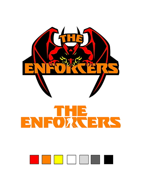
Finally, sketch number 15 was selected to be refined. This concept showcases two creatures. Two dragons facing in opposite directions. One symbolizing fire, the other symbolizing ice. Each will be illustrated with features that indicate which element they represent. The team’s name is written directly in the center to pull the viewers’ attention from the dragons. This concept was selected because it illustrates a creature that is not often used in relation to hockey. The unique approach of sing not one but two creatures in the logo will set The Enforcers apart from the competition and supports the theme of fire and ice.
Feedback 06
Logo Concepts Refined
Overall you are presenting strong work. When presenting on the different logos, expand on the information to better explain the choices. For example when explaining type logo you say, "The type of logo was selected because is clearly represents the fire and ice concepts of the chosen theme for the brand identity. The ‘H’ includes flames in the background that are meant to highlight the ‘H’ in the negative space. The ‘R’ below the ‘H’ includes an iceberg." Provide more detail about how the type chosen represents fire and ice. You do mention the iconography, but what about the type choices?
I would also like to see research connected to support your ideas. I do see Oliver cited in-text but not the other sources. Make sure to also bring in the course material
The strengths and weaknesses are on the right path, but a little more information will help delineate what is a strength and what is a weakness. Label each more clearly.
The strengths and weaknesses are on the right path, but a little more information will help delineate what is a strength and what is a weakness. Label each more clearly.
You have a very strong concept and one that will serve the brand well once executed. I look forward to seeing how this continues to develop.


The feedback above is in reference to the three logo concepts that were developed as vectors.
The idea of removing the word mark from the circle was taken and the second set of vector logo concepts were developed in response to that critique.
Feedback 07
The style guide.
Style Guide Feedback
Overall Design - There is good consistency throughout the guide aligning the elements and the messaging, but it is also very sparse. There is an elegance to the design that matches the logo.
Brand Archetype - Good work here. The work is clear and appears to accurately align with your overall messaging. Considering adding a visual elements here.
Logo - Overall nicely done. You are presenting two different versions of the logo. What is needed here are labels and captions to present each and to present how each and when each should be used. Visually the work is present, but we need explanations. With the primary logo (I assume this is the primary design because of placement), the design with the E, consider having the E separate and allowing the name to be complete so the audience does not need to attempt to read it as closely. They may not see the E in its ornamental setting.
Do's and Don'ts - This section appears to be missing.
Clear Space and Sizing - While you are showing an element of the logo, the E, make sure the element touches the edges of the guidelines. Also, with the secondary design, a different element is needed as the E is different in the seal of the lion. Make sure you are also presenting the sizing specs of the logo to show the minimum size the logo can be.
Video Rationale - Excellent work. Your explanations are great and you walk us through the process and choices well. You offer a good visual look at the process and the work overall is dynamic and engaging.
The Style Guide


This is in reference to the Enforcers style guide. The feedback was received; however, this was the first and last attempt at the Enforcers style guide. The nest portion of the project was coming due, and time was not allotted to go back and fix the mistakes in the style guide.
Feedback 08
Media Assets.
Production Planning & Schedule
-
Although attractive and well rendered, be careful that rendering technique does not surpass the reasoning behind the logo symbolism choices - why heraldry, why a lion, why the collegiate link? These are not explained by the Vision Board keywords or descriptions of the brand.
-
Defining and following-through on your brand will give a firm foundation to your reasoning and choices -- a story that must be told cohesively through the branding styling
-
Caution must be used when selecting "antique" or script fonts: contemporary audiences can seldom interpret the ornate letterforms correctly
This feedback was in regards to the plan for the media assets as well as the logo symbol and type selected. With this feedback in mind, the logo, type, symbol and overall theme for the Enforcers was revamped to ensure that the elements shown related to the brand and al served a purpose. Additionally a new type was selected to ensure legibility.

Feedback 09
New logo.

-
The new dragon logo is simpler, but no less effective. It is nicely rendered and its bold but interesting wordmark is much more direct and effective in conveying the brand.
-
The flames and hockey suggest a "fire and ice" theme
-
the jerseys are an opportunity to be a little dynamic and visually compelling - breaking from the strictly linear, complacent "standard" designs in representing your brand
-
Please make sure to include all the required portions of each assignment to avoid larger point losses that detract from your very strong design work
The second iteration of the jersey was designed in response to the feedback given. After doing additional research and noting the creativity and dynamic designs displayed on other ECHL team jerseys, the second iteration was developed.


Feedback 10
Final Logo Concept
Remember that examination and adjusting of the brand asset work and accompanying design thinking often occur as a natural part of the ongoing design Process. Stick with it and made progress and advances to consolidate your Brand and present more coherent thinking!
-
The necessity and rationalizing of TWO disparate logos will be a very difficult sell to anyone interested in your brand reasoning. Though both approaches are nicely rendered, they visually represent two very different ideas -- which is tough to justify
-
A brand needs a cohesive approach -- it needs to tell one story throughout, have one personality on display. It is tough to recognize as a single brand when it is represented in two distinct concepts that have little to do with each other
The feedback here is in reference to the final design of the Enforcers logo.
Though the feedback was valuable and should have been taken heed of. When applying the logo without the dragon to media assets, the design did the job but lacked excitement. The two logos were continuously used in the creation of the media assets in hopes that the dragon would convey the thrilling aspect of the brand identity.
Feedback 11
Media Assets

The required parts of this assignment were completed accurately. The last of the six required Media Assets were initiated, rendered and compiled into a cohesive Brand presentation.
The Journal Video for Week 4’s final entry includes an organized, well-presented video that shows visual examples and verbal exposition of the work produced this week, and reflection on gains made this month. The video was embedded properly in the Journal, and the LINK was posted within the LMS platform. Visualized work examples were demonstrated.
Stephanie, your work progressed well during the four weeks of development in this course! Multi-Platform Delivery is the first moment that students form the “big picture” of what their branding is about, and how to pull all the strings together to weave one cohesive idea. This developmental thinking is a necessary process that you embraced and worked hard on. The impediment that remains is to really reconsider the strength of your argument for two disparate logos.
Note: straight 100% yellow is not a great choice to stand out against white backgrounds. There is not enough contrast. I suggest some red in the yellow for contrast.
The feedback above is in reference to the brightness of the yellow in the brand identity system. The yellow selected was in fact too bright and rendered it difficult if not impossible to read the white type placed over it. The original version mentioned is the team logo applied to a billboard shown here.

The refined version here:

Now the type is not fighting with the yellow in the background and is legible. It was imperative to make this change because yellow can also cause visual fatigue (Cherry, K. 2022). The intense yellow is no longer adding strain to the eye.
Feedback 12
The Enforcers Playbook.
As you have been instructed, you are the one that is to evaluate your work when designing the playbook as that is part of being able to master your skills. You are no longer being art directed like your previous courses. However, here are a few things you may want to consider.
*Have you considered cutting out your pictures so they are standalone?
*Have you considered the contrast on your type?
Again, you are to follow your mood board to start. As your style may have evolved, you may consider updating the mood board as well. You are to follow the thought process of the playbook example.
The feedback is for the first draft of the Enforcers playbook shown here:


 |  |
|---|---|
 |  |
References
Kendra Cherry, Mse. (2022, May 11). The impact of the color yellow on your mood. Verywell Mind. https://www.verywellmind.com/the-color-psychology-of-yellow-2795823
NHL.com, & Creamer, C. (2017, June 13). Greatest NHL logos of All time. NHL.com. https://www.nhl.com/news/greatest-nhl-logos-of-all-time/c-289861934
University of Michigan. (n.d.). Lion. http://websites.umich.edu/~umfandsf/symbolismproject/symbolism.html/L/lion.html